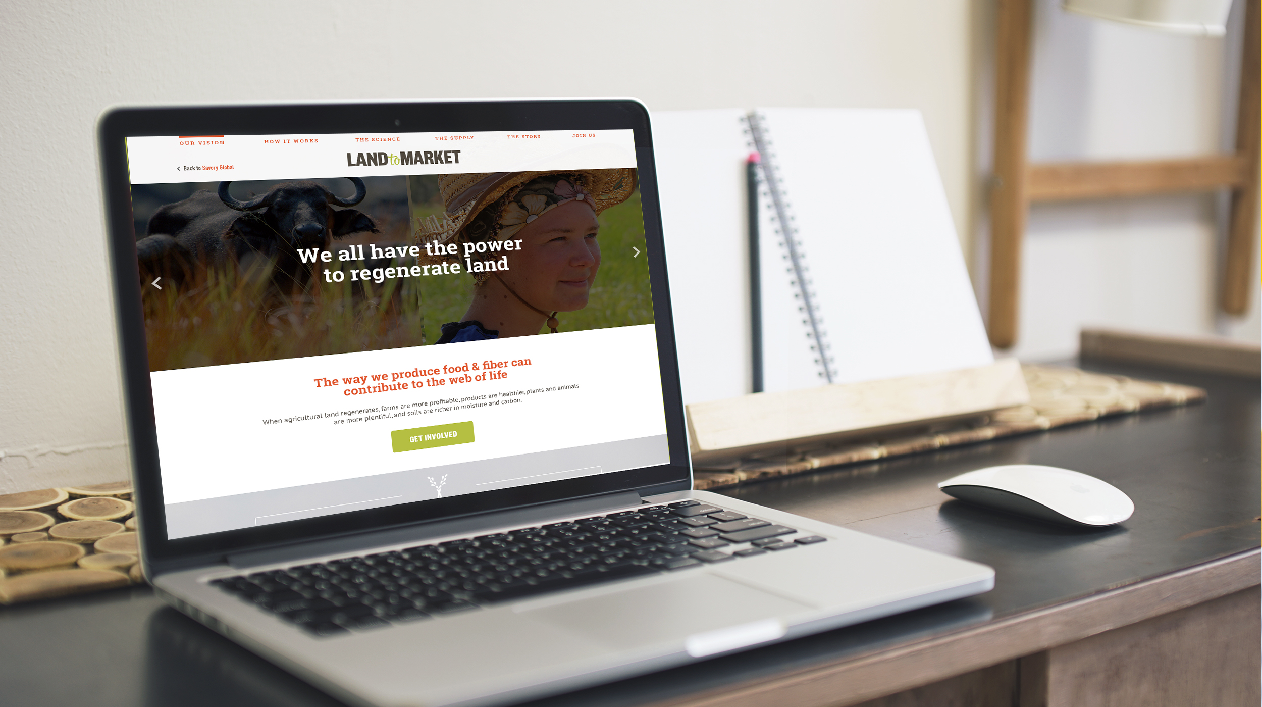
Land to Market
Land to Market's work promoting products created through regenerative farming practices needed a solid brand and visual identity to represent it. I worked with them to create a logo (with versions for business units in their network), verification seal, investor deck template, brochure, and landing page.


Moodboards
We began the discovery process with moodboards, collecting inspiration for three visual directions and color palettes.


Logo Exploration
After aligning on a visual direction, we explored several different logo options. The final mark needed to incorporate elements of Land to Market's parent brand, Savory Global, while communicating the concept of grassland regeneration.

The mark also needed to be adaptable enough to work as a single icon, the logo and wordmark, as well as a seal that would be affixed to ecological outcome verified products.

The final mark incorporated the wheat from the parent brand's logo into a "verified" checkmark that carried through the logo and the EOV seal.


